Considering the sheer number of restaurants in the marketplace today, it isn't surprising when owners turn to gimmicks to make their venues stand out.
When it comes to building hype, these ideas can work really well. The excitement around newly opened Cereal Anytime (Australia's first cereal café) has been huge. Melbourne’s famous Cat Café has been booming for months now.
Even McDonald’s recently jumped into the fray by opening a hipster-friendly health food cafe in Sydney.
But while these ideas are great from a marketing perspective, they don’t always have a lot of staying power. Some restaurants find their profits suffering significantly when tourists move on to the next biggest craze.
We took a look at 3 restaurants that made their gimmicks work over the long-term… and 3 that took the wrong approach.
Gimmicks that worked
Dans Le Noir
Dans Le Noir is famous around the world for its ‘blind dining’ concept. Blind or visually impaired waiters guide diners into a pitch-black restaurant, where they are then served surprise menu items. Since launching in Paris in 2004, the restaurant has expanded to locations in London, Barcelona, New York, St Petersburg and Kiev.
Why It Works: The restaurant bases is premise around the fact that it’s about the food and only the food, which appeals to the foodie obsessed population we’ve become. There’s also a philanthropic element at play – not only does Dans Le Noir support disability awareness, but it also donates a percentage of its profits to charity. This causes diners to feel emotionally sympathetic towards the restaurant, which is ten times more powerful than its status as a tourist destination.
Safe House Restaurant
This Milwaukee restaurant is decked out like a CIA safe house. Diners have to say a secret password to get in, and then they have to work their way through a network of passageways and challenges before they reach the restaurant. The venue has been in operation since 1966, so it’s definitely doing something right.
Why It Works: The reason Safe House has staying power is simple. It understands who its target market is – tourists – and markets itself almost exclusively to them. The owner also cleverly chose a location across the road from a theatre, so local punters hunting for more entertainment gravitate to his restaurant.
Traveler Restaurant
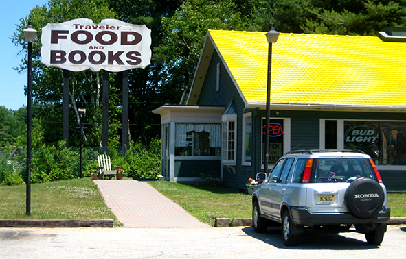
The gimmick here is simple. This combined restaurant/bookstore allows diners to take home 3 free books after every meal.
Why It Works: Traveler sits on the highway between Boston and New York, in an area full of literary landmarks. After recognising that there was a niche he could fill, the owner put up a big sign that says ‘FOOD and BOOKS’ to lure in long distance travellers. The interior, which is covered in books, encourages exhausted drivers to stay and read for as long as they like.

Gimmicks that didn't work
Pearl Restaurant
Pearl was a fixture in the Melbourne fine dining scene for 12 years, but attempts to innovate – introducing an iPad-only menu, where diners could look up tasting notes, information about winemakers and food pairing suggestions – fell flat. The restaurant eventually closed in 2012 when the restaurateur decided to move on to other projects.
Why it Didn't Work: The problem with basing your marketing around a concept like this is that technology is fleeting. This menu idea was fashionable from about 2011-2013 when iPads were the top gadget on the market, but it’s rarely done anymore – probably because owners realised how expensive it was to replace broken and stolen menus.
The Clinic
To its credit, the Clinic fully committed to its hospital theme. Diners at this Singapore restaurant/bar sat in wheelchairs while sucking their cocktails out of IV bags. The whole venue was decked out like a surgical ward. Unfortunately, the novelty wore off and it closed down after 3 years.
Why it Didn't Work: The Clinic was quite popular with clubbers, but customers weren’t happy with the service or the overpriced drinks. Many also considered the concept offensive.
T Poutine
This niche restaurant claimed it would bring the authentic tastes of Canada to New York’s Lower East Side, but the idea just didn’t take off. The venue closed after 9 months.
Why It Didn't Work: There’s certainly a market for Canadian junk food in New York, but unfortunately the chef just didn't know his product. The negative reviews spread like wildfire, and the NYC market was too unforgiving and competitive for the business to survive.
Take aways
While these examples are all fairly diverse, there are a few common take-aways.
When coming up with a gimmick or theme for your restaurant:
- Focus on gimmicks with longevity – avoid technology or pop culture related trends that will disappear within a year.
- Consider whether or not your idea will offend – is the potential for negative publicity worth it?
- Find a concept that resonates emotionally with your diners – for example you might only use ethically sourced ingredients.
- Don’t rely on a theme or gimmick to retain your customers. Focus on offering the complete package in terms of customer service and quality food. Customers might be drawn to your venue out of curiosity, but it’s the traditional elements that keep them coming back.