.gif?width=1200&height=400&name=Hubspot%20Blog%20banner%20GIF%20(2).gif)
While there are many elements that go into creating a strong hotel website, the most important is undoubtedly the design.
It’s sad but true that it takes about 0.05 seconds for users to form an opinion about your website. If they like the layout, then they’re going to read the content and explore the other pages. But if their impression is negative, then they’re going to backtrack and resume their search somewhere else.
A typical hotel guest visits at least 6 hotel websites before deciding where to stay, so those 0.05 seconds mean everything when it comes to getting the one-up on your competitors.
"Design matters at every stage of the process. It isn't easy, and it increases costs, but it also boosts profits, sometimes to a massive extent. In an increasingly competitive market place design reprints the best chance you have of transcending your competitors."
—Jay Greene, 'Design Is How It Works'
Your logo
There are four main elements you should consider when it comes to boosting your site’s visual appeal.
The first is your logo, which provides a quick visual summary of your hotel’s identity. Its colours, images and typography all stimulate feelings that customers will always associate with your brand.
Take the black Tiffany & Co logo, which is one of the most recognisable logos in the world. It is designed to make you feel bold, serious and luxurious because it’s associated with the formality and mystery of night.
![]()
If your hotel is a boutique location targeting high-end customers, then the logo should convey this through its sleek and sophisticated appearance. If you run a homely B&B, then the logo should elicit feelings of comfort. Consider the adjectives you would use to describe your hotel when coming up with a concept.
Your homepage layout
Your homepage acts as your shopfront window. If the layout is overcluttered or difficult to navigate, then it’s going to reflect something about the way you manage your hotel.
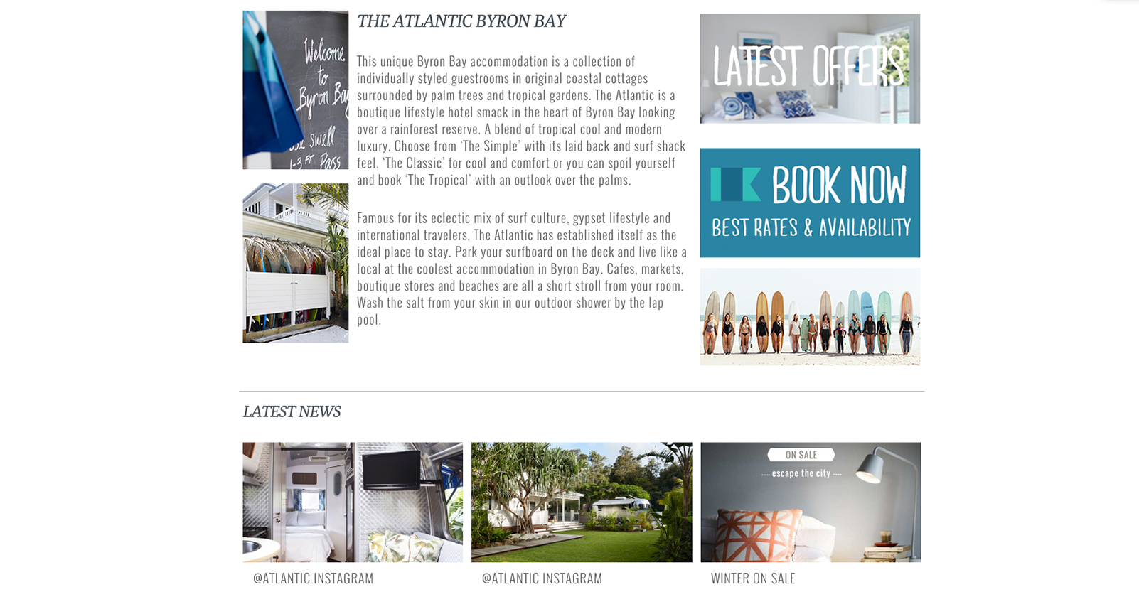
When I asked our designer for her favorite hotel website, she immediately pointed to The Atlantic in Byron Bay for its clean, attractive layout. “Their accommodation truly reflects what they display across their website,” she said.
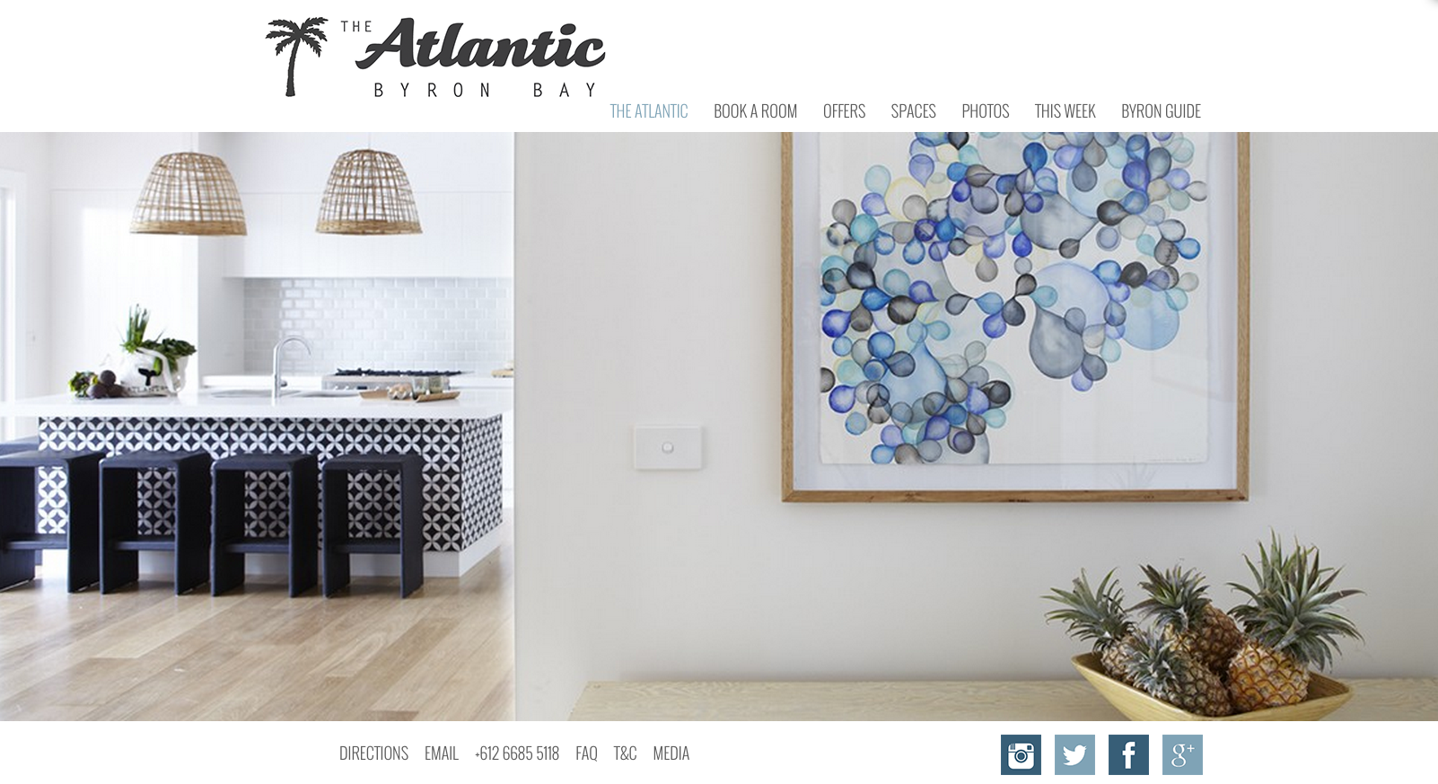
Their homepage focuses on these basic elements:
- A strong central image
The rotating hero shots immediately show off the accommodation’s most enticing aspects. The rooms look bright, beachy, minimalist and relaxed, and it’s clear they’re targeting laid-back beachgoers with a reasonable budget.
- A short description
People skim read online, and this website gets that. The page favours photography over content. There is a short, informative hotel description, but it doesn’t take up unnecessary space on the page.
- A book now button
The book now button is brightly coloured and prominently positioned. Including a ‘Book a Room’ option in the navigation menu also allows users to easily make a booking no matter where they are on the site.
- Latest offers
Adding a second call to action button reinforces their main message (book here) while also offering an additional incentive (save money).
- Social media validation
Linking to pages like Facebook and TripAdvisor offers visitors reassuring and objective feedback about the accommodation.
Your navigation menu
A Tnooz study of 300 hotels across the world confirmed that the most important pages for hotel guests are the home page, the rooms page and the booking engine/rates page.
Other items you might include are the facilities, local attractions, special offers and your contact details. Stick to these 6 or 7 elements to give your users a straightforward experience.
According to Kissmetrics, we give most of our attention to the first and last items on the menu, so consider making these your most important pages: rooms and book now.
Your photography
People make holiday purchases for emotional reasons. If your images make them feel happy or envious – if they can see what they will experience when they visit your hotel – then they will be more likely to make a booking.
Interestingly, photos of people also lead to higher conversions, because they allow customers to see someone else happily enjoying the experience, so consider including candid shots of hotel guests.
User testing your website
Find out how effective your website is by asking a friend to take it for a test drive (preferably one who isn’t already familiar with its layout).
Ask them to make note of the following things:
- What was the first thing that attracted your attention on the homepage?
- In what order did you visit each page?
- Were there any pages that you didn’t look at?
- Was there anything that caused you confusion or difficulty?
- How straightforward was the booking process?
- How much time did you spend on the website overall?
It can be hard to view your website with an objective eye when you’re so invested in its performance. This feedback will draw your attention to elements that you haven’t even considered. Ultimately, it will help you identify the changes you need to make to convert visitors into paying guests.
If you're looking for more advice, this helpful guide on First Site Guide dives a lot more deeply into the steps you need to take to launch a website – we recommend giving it a read.


